Reimagining NYX.today
Transforming a fragmented adtech SaaS into an integrated conversational AI ecosystem.
View Site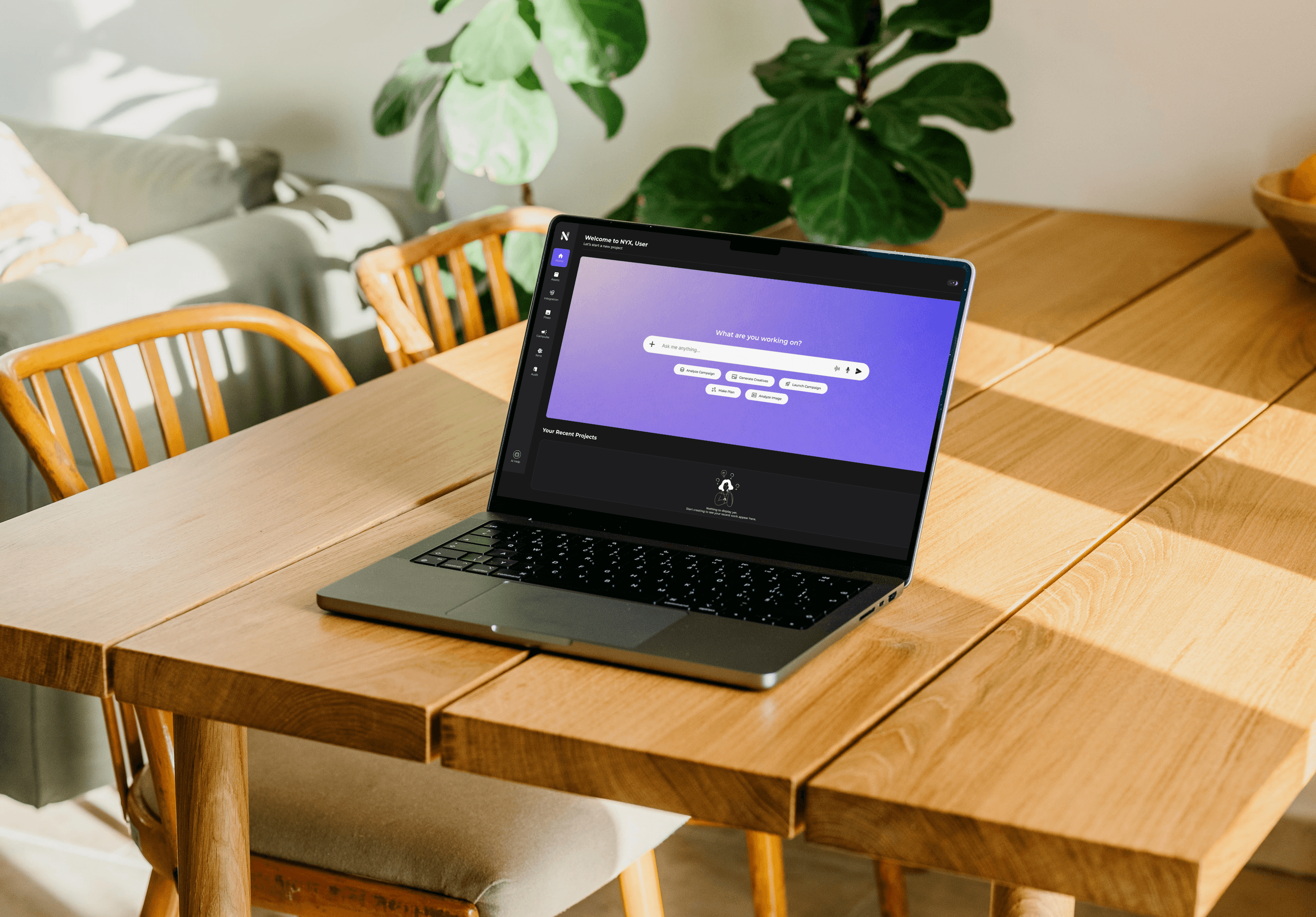
Goal
Transform a fragmented, click-heavy SaaS layout into a centralized, conversational AI workspace that lifts the successful campaign generation rate, while working strictly within existing engineering and architecture constraints.
Challenge
The original modular homepage layout hid the true interconnected power of NYX.today, forcing users into tool-specific silos that increased cognitive load and delayed campaign execution. We needed to transition the platform into a centralized, conversational workspace without altering the underlying application architecture or breaking developer constraints.
Outcome
A complete product overhaul that unified creative generation and campaign deployment into one conversational workspace, raising task efficiency by 24%, cutting support tickets by 40%, accelerating activation by 30%, and reaching 100% WCAG AA compliance.
I delivered a complete product overhaul that transformed a fragmented, click-heavy SaaS layout into an integrated conversational AI ecosystem, helping agencies move from creative generation to campaign launch without switching tools.
Project overview
Nyxify Technologies operates NYX.today, an AI-driven marketing automation platform built for high-growth brands and mid-to-large digital agencies across India. The company operates on a B2B SaaS subscription model, scaling revenue based on active workspace features and processed advertising volume.
- Neo: the primary conversational orchestration hub
- Pixieo: a unified image and video generation core
- Xeno: a single-prompt, fully autonomous campaign engine
- North Star Metric: Successful Campaign Generation Rate
Why this problem matters
Prior to my redesign, NYX.today possessed highly advanced proprietary AI capabilities, yet suffered from a fractured user experience. In the fast-paced Indian adtech ecosystem, software reliability directly correlates with brand authority. The original system relied on disconnected tools that forced users to manually jump between independent image, video, and campaign screens. This fragmented layout caused severe cognitive friction for pilot users.
This platform friction carried an immediate operational cost: product demonstrations with marquee Indian digital marketing agencies frequently stalled because the interface failed to demonstrate the true automated power of the product. This friction placed potential business pipelines worth lakhs in enterprise subscription revenue at risk due to perceived product instability.
The business trigger
Midway through my seven-month timeline, the core product model underwent a massive evolution. The product moved away from isolated, click-heavy execution modules toward a centralized, generative AI workspace powered by three core engines: Neo (the primary conversational orchestration hub), Pixieo (a unified image and video generation core), and Xeno (a single-prompt fully autonomous campaign engine).
During our pilot phase, the product management team realized that users increasingly expected generative AI systems to behave conversationally rather than through traditional, rigid navigation structures. Forcing a user to configure an ad campaign through endless form fields felt outdated compared to modern conversational tools. This created immense pressure to abandon our original modular homepage layout and design a unified, chat-driven workspace from the ground up.
Cross-functional collaboration
As the solitary UI/UX designer within the company, I assumed full responsibility for translating this architectural pivot into a clear, usable interface layout. My day-to-day alignment occurred directly with the Product Management team to define product milestones, handle scope trade-offs, and transform feature requirements into user-facing systems.
I also synced periodically with the founder to present major strategic shifts and ensure design directions aligned perfectly with upcoming fundraising goals. Because the entire development team sat in a separate department, I built a structured design-to-development pipeline from scratch. I independently managed the handoff of engineering assets, defined functional interaction states, and ran systematic design QA directly inside their engineering sprints.
- Founder: strategic alignment and fundraising direction
- Product Managers: primary daily alignment on milestones and scope
- Solo UI/UX Designer (me): end-to-end UX strategy and system execution
- Dedicated Engineering Team: a separate full-stack and frontend department
Project constraints
The parameters of this project were sharply defined by engineering limitations. Because the platform was live with active enterprise configurations, the product managers and development team had limited bandwidth for structural or architectural code refactoring. A complete database or workflow restructure was fundamentally off the table. Every deep UX problem had to be resolved purely through interface logic: manipulating visual hierarchy, engineering reusable component structures, perfecting typography scales, and building consistent layout systems without breaking existing URL paths or back-end API payloads.
Market observation
To ground my strategy in regional competitive realities, I mapped the gaps across the current Indian AdTech landscape through three core market observations.
- Most creative marketing software options stop entirely at static visual or content generation, lacking downstream implementation features.
- Most traditional performance campaign utilities isolate themselves at downstream budget deployment, offering no built-in creative generation tools.
- A major market opportunity exists for an ecosystem that seamlessly bridges asset creation and live media execution inside a single, continuous user context.
Who we spoke to
To ground the redesign in real buying behavior, I ran consolidated testing loops with participants drawn from across the Indian agency and brand landscape.
- Digital Agency Account Directors (4): recruited via the partner network in Mumbai and Bengaluru, managing ad budgets exceeding ₹5 lakhs monthly and evaluating software on speed and multi-client transparency.
- Performance Marketers (5): sourced from tech co-working hubs in Delhi NCR, highly technical, requiring immediate access to campaign ROI metrics, budget burn rates, and asset generation history.
- D2C Brand Founders (3): reached through startup ecosystem referrals, with limited formal design or ad-buying expertise, relying on the AI platform to generate instant, trustworthy creative assets.
What users told us
My consolidated testing loops exposed systemic multi-app fatigue. Users were explicitly overwhelmed by the requirement to manage assets across fractured product tabs, as captured in their direct feedback:
“The tools work fine individually, but constantly moving between them to download and upload files completely slows down my creative rhythm during busy client seasons.”
“Creating an ad asset in one menu and then setting up the budget inside another feels like restarting my entire workflow from scratch every time.”
Legacy UI audit
When reviewing the live product that was running when I joined, I discovered three recurring UX problems that directly threatened user trust and system adoption.
- Asymmetrical homepage card silos: the original baseline layout split tasks across an inconsistent arrangement of five primary launch cards (Launch Agentic Campaigns, Generate Image Ads, Generate Product Photo-Shoots, Launch and Optimize Campaigns, Analyse Creative's Potential) and dropped a lone sixth card (Generate Video Ads) onto its own row. This created an awkward visual anchor and left massive dead space, while burying recent project histories under text-heavy blocks.
- Chaotic, overlapping analytics visualization: the core campaign monitor ran a highly confusing dual-axis performance area chart. It plotted a yellow spend line and a magenta CTR trendline simultaneously over an identical coordinate grid without distinct background separation. This created an unreadable intersection layout that forced marketers to manually calculate actual metric performance shifts.
- Disconnected creative editing environments: the early interface embedded a detailed photo manipulation space featuring extensive right-hand property slider columns (blur, transparency, brightness, contrast, saturation, exposure, warmth, shadows, highlights). This layout functioned in absolute isolation, separated completely from the campaign deployment system and forcing users to run manual asset downloads and structural re-uploads.
Problem statement
The original modular homepage layout hid the true interconnected power of NYX.today, forcing users into tool-specific silos that increased cognitive load and delayed campaign execution. We needed to transition the platform into a centralized, conversational workspace without altering the underlying application architecture or breaking developer constraints.
The signature insight
The problem wasn't that the individual tools were weak. The problem was the massive operational gap between them. Users weren't dropping off because the generation engine failed; they were dropping off because downloading assets from a creative tool and re-uploading them into a separate campaign launcher created severe, repetitive context-switching exhaustion.
To fix this structural broken loop, I mapped out the consolidation of our core features into an interconnected flow.
- Old workflow (fragmented, multi-step): Generate asset → Download file → Open campaign tool → Upload again → Launch ad.
- New workflow (unified, contextual): Prompt input → Concurrent creative generation → Instant review → Live launch.
Why we rejected alternative directions
Before committing, I weighed three strategic options against the creation-to-deployment gap and our engineering constraints.
- Option A, improve the existing modular dashboard layout: refines individual component metrics but preserves deep tool context switching and fails to bridge the creation-to-deployment gap. Rejected.
- Option B, construct conversational interface overlay panels: introduces a floating assistant window that completely blocks underlying asset generation previews and live analytics tables. Rejected.
- Option C, establish a unified, split-screen Neo Hub: eliminates workflow fragmentation while maintaining absolute visibility of output assets alongside the active chat context. Selected.
Shift in strategy and trade-offs
This realization completely changed our approach. Instead of building alternative multi-step setup wizards, I recommended to the PMs and the founder that we replace the static homepage entirely. We shifted our focus to an architectural transformation: merging the text-to-image and text-to-video tools into a single multimodal application called Pixieo, integrating the autonomous single-prompt campaign infrastructure called Xeno, and tying everything together under a central chat orchestration layer called Neo.
To implement this without overloading our separate development team, I made a strict product design trade-off. I chose to postpone the creation of complex file management structures and asset sorting systems. Instead, I prioritized a clean, unified split-screen workspace that dynamically displays previews alongside live conversations, keeping developer implementation straightforward and efficient.
A difficult trade-off
During our cross-functional alignment syncs, severe stakeholder tension emerged regarding layout execution.
- The founder wanted maximum visibility for every single sub-agent backend calculation, to actively prove the technical power of the proprietary AI models to potential investors.
- The engineering team demanded the simplest possible data grid structure to avoid running into technical execution limits over their rapid backend sprints.
- The target users needed clean, lightning-fast workflows completely stripped of technical noise to deploy ad campaigns under tight agency client timelines.
Resolving the tension
I resolved this friction by introducing an expandable, persistent sidebar layout paired with responsive action chips. This strategy kept engineering implementation straightforward while completely hiding complex agent sub-processes behind clean, contextual confirmation states, satisfying user speed requirements while keeping technical validation available on demand.
Ideation and rejected concepts
When the product pivoted toward a conversational interface, my first concept design treated the chat input field as a floating modal window laid on top of the original grid interface.
Direct validation loops with the PMs and initial engineering check-ins quickly exposed the flaws of this approach. The floating chat layout felt disjointed and blocked users from seeing generation previews or underlying data tables. I rejected this overlay model and designed an integrated, split-screen architecture where the conversational panel acts as the main core interface, directly outputting interactive assets and data blocks right into the main flow.
Wireframes
Before committing to high-fidelity visuals, I mapped the conversational workspace and its supporting surfaces as low-fidelity wireframes, validating layout structure and hierarchy without breaking the existing engineering architecture.
Product architecture
This structural evolution outlines how we shifted from a fractured, multi-window layout into an integrated, single-context conversational hub.
A single user prompt enters the Neo Hub, which detects intent and orchestrates the rest of the system end to end.
- A user prompt (for example, “Launch an e-commerce campaign”) enters the Neo Hub intent-detection layer.
- Neo routes the request to Pixieo for creative generation and to Xeno for deployment.
- Both engines converge into a single unified live campaign stream.
Navigation architecture
To deliver a clean, customizable layout environment without introducing database-level structural updates, I engineered a flexible global navigation structure featuring a dedicated user pinning zone.
- Core Orchestration Anchor: the Neo Chat Core, the central conversational engine homepage.
- System Toolsets Index: the Pixieo workspace (unified text-to-image and text-to-video engine) and the Xeno automation engine (single-prompt campaign deployment).
- User-Customized Pinning Zone: a dynamic drag-and-drop area for pinned feature slots, such as the Pixieo generation feed or a Xeno real-time analytics card.
- System Configurations: profile, billing, and API connections.
Contextual user journey
To demonstrate how the system responds to real-world tasks, here is the direct interactive path an agency director takes when setting up a live campaign.
- User prompt: “Launch a Diwali skincare campaign,” routed through the Neo engine context layer.
- Pixieo core automatically generates visual asset variations.
- Xeno automation builds localized target audiences and budget plans.
- A validation interface checkpoint lets the user review a confirmation card and confirm deployment.
- On live engine handoff, the campaign launches while an optimization feed tracks live budget health.
Designing for AI UX challenges
Unlike traditional SaaS software, building a conversation-driven automated interface introduced unique behavioral issues that required intentional layout responses.
- The blank-slate problem: users froze when faced with an empty chat container, unsure how to structure their initial commands. Design response (prompt chips): I surrounded the empty text input with high-impact quick-start chips (such as Generate Creatives or Launch Campaign) that serve as direct visual entry points, eliminating hesitation instantly.
- Agent selection confusion: users didn't know which specific machine learning engine to use for distinct asset production or deployment tasks. Design response (intent routing): I designed the homepage to run entirely on intent detection, with Neo acting as the central gatekeeper, parsing conversational text and automatically activating Pixieo or Xeno in the background based on context.
- Automation mistrust: media buyers feared autonomous campaign execution would spend client budget incorrectly. Design response (validation layers): I built multi-stage verification checkpoints into the chat flow, so Xeno cannot deploy live ads without rendering a distinct, scannable confirmation card that explicitly outlines audience targets, budget caps, and channel breakdowns for approval.
Persistent global sidebar
Problem: Deep conversational flows often filled the screen, causing users to lose track of their position within the wider application.
Insight: Users require a fixed visual baseline to navigate complex, multi-agent workspaces confidently.
Decision: I implemented a strict, immutable global sidebar layout that anchors core platform spaces, keeping global workspaces accessible at all times.
Split-screen content architecture
Problem: Forcing users to scroll down or swap windows to check generated assets disrupted their mental focus.
Insight: Conversational prompts and their visual outputs must exist within the same visual frame.
Decision: I structured a twin-panel layout model. The left area houses the conversational thread, while the wider right canvas displays live image previews and data grids instantly.
Custom navigation pinning
Problem: Performance marketers used separate optimization reports far more frequently than creative generation feeds.
Insight: Interface efficiency scales rapidly when operators can personalize their primary navigation environment.
Decision: I engineered a custom drag-and-pin area within the global sidebar, letting users pin frequently used features directly to their navigation tray.
Signal-driven recommendation cards
Problem: Marketers routinely ignored automated suggestions because typical layout grids looked uniform and failed to highlight financial risk.
Insight: Automation insights require distinct visual grouping and explicit financial impact labeling to drive action.
Decision: I redesigned the recommendations view into a modular feed. Each card isolates its target optimization category, explicit data signals, and risk assessments, complete with a prominent command button.
Accessibility engineering
To support long monitoring sessions and maximize visual clarity under variable agency lighting, I personally managed the platform accessibility overhaul to ensure full AA compliance.
- Contrast repair: fixed 43 individual color contrast failures across high-density analytics components and input fields.
- Token architecture rebuild: structured the functional color token system around a high-contrast primary purple anchor (#7648EF) and an accessible secondary text variant (#B39DFF), exceeding a strict 4.5:1 ratio against dark canvas backdrops.
- Screen-reader infrastructure: introduced clean descriptive aria labels and precise focus states across all active charting elements and operational toggles.
Usability testing
I tested high-fidelity prototypes across three successive validation cycles with external agency media buyers and product managers. Testing exposed a fundamental architectural failure: when users ran deep conversational sequences within the central chat hub, the interface expanded to fill the entire screen. This completely hid the global navigation sidebar, causing users to lose track of their workspace context and feel trapped inside the chat loop.
To resolve this issue, I made the primary global sidebar persistent and introduced prominent agent state indicators that explicitly flash which system engine (Neo, Pixieo, or Xeno) is currently running. I also added a drag-and-pin mechanism that lets users select any deep tool module (such as an optimization feed or budget tracker) and lock it directly to their navigation sideboard, ensuring fast access and constant workspace control.
The final product
The final configuration achieves absolute visual clarity, balancing complex multi-agent automation with clean, scannable layout structures.
- The Neo conversational engine homepage: replaces the cluttered legacy dashboard with a premium, focused conversational panel, using context-aware action chips to guide user interactions cleanly.
- The Pixieo multimodal design space: merges independent creative tools into a single, cohesive workspace, enabling media creators to monitor text-to-image and video assets side-by-side.
- The Xeno autonomous launch pad: replaces multi-step wizard fields with a single-prompt setup, using high-visibility validation cards to eliminate deployment uncertainty.
- The signal-driven recommendation center: translates complex data alerts into scannable cards, enabling media directors to perform real-time campaign adjustments with immediate system feedback.
Measurable business impact
The operational value of this product architecture transformation was validated directly across internal databases, marketing logs, and partner tracking systems.
- Task completion efficiency raised by 24%, validated through internal database transaction timestamps tracking the exact speed of user progress from initial prompt input to live budget deployment.
- Customer support tickets dropped by 40%, monitored via customer success tracking platform logs over a 60-day window following rollout, proving a significant drop in interface confusion.
- Workspace activation speed increased by 30%, measured through GA4 interaction events tracking active user utilization of multi-agent prompt configurations.
Enterprise pipeline conversion velocity
To provide believable validation to stakeholders without relying on arbitrary revenue assumptions, we measured the design overhaul success by tracking its direct impact on our enterprise sales pipeline velocity. By moving from a fragmented toolset to a unified conversational core, we drastically reduced prospect hesitation during live product demonstrations.
- Demo-to-trial conversion lift: +35% increase, tracked via enterprise CRM deal-stage movement logs during live platform demonstrations with Indian agency prospects.
- Enterprise evaluation cycle time: -28% reduction, measured as the average number of days an account remained in an active product trial phase before technical sign-off.
- Pipeline deal qualification rate: +20% improvement, drawn from sales team feedback loops showing a drop in client hesitation regarding software reliability during pitch cycles.
An enterprise sales acceleration engine
By framing the platform impact through clear conversion velocity percentages rather than speculative financial projections, the design system directly proved its worth as an enterprise sales acceleration engine. The premium feel of the interface allowed the product management team to advance high-value agency accounts through the evaluation pipeline far more predictably than the legacy layout allowed.
What we got wrong
Early in the project, I assumed that performance marketers preferred dense, compact data presentation to maximize screen real estate. Based on this assumption, I designed an ultra-compact data table that packed all asset outputs and campaign metrics into a single screen view. Usability testing with our product managers and trial users quickly disproved this direction, as individuals found the dense layout overwhelming and struggled to identify key actions. I adapted immediately, introducing structured tab groups and clearer spacing that improved data readability without requiring backend engineering changes.
What failed and what I learned
This project highlighted the immense value of designing within strict engineering boundaries. Being the only designer in the company taught me how to collaborate closely with product managers to validate user needs against business realities, while managing handoffs to a completely separate development department. I had to discard a few complex interaction concepts because they exceeded technical implementation capacity. This taught me a vital lesson in design restraint: a perfectly executed standard component is infinitely better than an overly ambitious custom interaction that fails in development. I learned to ground my creativity in technical reality, using precise spacing, typography, and contrast to solve complex layout problems.
Future roadmap
The foundational design system established during this overhaul sets up a clear path for future product growth. As engineering bandwidth expands, the next development cycles will focus on introducing several capabilities.
- Natural language campaign editing: allowing performance buyers to modify live budget structures and audience fields using text commands directly inside the optimization view.
- Multi-agent collaboration flows: enabling concurrent execution syncs between Pixieo and Xeno to automatically swap underperforming creatives with fresh variants based on cost metrics.
- AI-generated campaign retrospectives: providing automated end-of-month client performance summaries that compare ad execution patterns against regional e-commerce benchmarks.
- Cross-workspace memory infrastructure: allowing the central Neo engine to retain cross-account historical prompt settings, significantly accelerating the campaign setup lifecycle for multi-client digital marketing agencies.
“The problem wasn't that the individual tools were weak. The problem was the massive operational gap between them. Closing that gap, without touching the underlying architecture, is what turned a fragmented product into a conversational AI ecosystem agencies could trust.”