HabotConnect Task Management System
Designing a faster, clearer, and more reliable task workflow for internal operations.
I designed an internal task management system for administrators who live in it all day, where the whole job was protecting momentum: scan a list fast, assign without leaving it, and go deep only when the work demands it. A client project that did not launch.
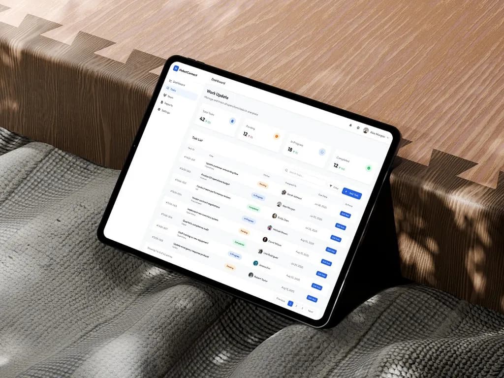
Goal
Design an internal task management experience that prioritizes speed, clarity, and context preservation for administrative users.
Challenge
The challenge was not to build an overly complex management platform. It was to create a system that made routine operational work feel clear, fast, and dependable, while helping users scan tasks quickly, assign work without breaking context, and move from summary to detail without feeling lost.
Outcome
The final concept delivered a modern internal tool that feels structured, lightweight, and operationally reliable. The workflow now balances fast scanning, quick assignment, and deeper review in a way that supports repeated use without increasing cognitive load.
In operational teams, task management is rarely just about checking boxes. It is about visibility, accountability, and speed. For HabotConnect, the challenge was to design a task management experience that could help administrative users stay on top of operational work without feeling slowed down by the system itself.
Project overview
HabotConnect Task Management System is an internal operations interface designed to help administrative teams manage, assign, and track tasks in one centralized place.
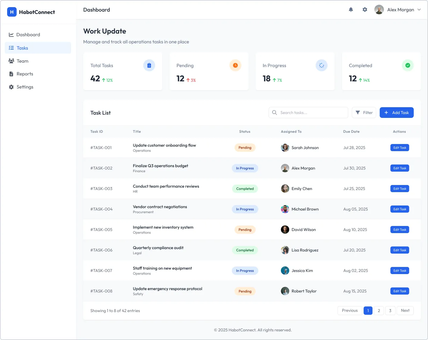
- View and scan all tasks from one structured dashboard
- Assign work quickly through a contextual modal
- Review full task information in a dedicated detail view
- Reduce friction in dense internal workflows without sacrificing clarity
UI showcase
Previous UI, updated UI, and wireframes.
This section only renders the visual artifacts that exist for each project, so unavailable categories stay hidden automatically.
Routine work should feel fast, not repetitive
In task-heavy environments, administrators need to move through information quickly. They need to understand status at a glance, assign work without losing momentum, and dive into details only when necessary. If the interface introduces unnecessary steps or cognitive load, even simple actions start feeling repetitive and inefficient.
The challenge was not to build an overly complex management platform. It was to make routine operational work feel clear, fast and dependable, for administrative users doing it all day.
- How can a user scan many tasks quickly?
- How can they assign work without breaking context?
- How can they move from summary to detail without feeling lost?
- How can the interface communicate status and progress instantly?
The approach that followed from it
A clean, professional internal-tool aesthetic. Rather than decorative UI, the focus stayed on structure, readability and interaction clarity.
- Context preservation through a modal-based assignment flow.
- Progressive disclosure from dashboard to modal to task detail.
- Consistent visual language across statuses, cards, buttons and navigation.
- Efficiency-first decisions optimised for repeated operational use.
Two kinds of work: scan the list, or open one task
From the dashboard, users either open the assignment modal from the add task button, or click straight into a task row for detail. That split creates two clear types of work, quick action from the list and deep review in the detail view, and the simplicity of it became one of the strongest parts of the experience.
- Dashboard as the operational control centre.
- Assignment modal for quick in-context task creation and assignment.
- Task detail page for full review of metadata, progress, comments and related work.
A table to scan, a modal to act, cards to read
Four decisions, all serving the same goal: never make the user lose their place. Each one picks the pattern that matches what the user is doing at that moment rather than applying one layout everywhere.
The reasoning behind each of the four
- Table-based dashboard: lets users compare tasks quickly, scan status, due dates and ownership at a glance, and understand workload without opening every item. High-level summary cards at the top give an immediate pulse of total, pending, in-progress and completed tasks.
- Modal-based assignment: keeps users anchored to the task list, turns assignment into a lightweight action instead of a navigation event, and removes the friction of returning to the dashboard after each one. The overlay keeps the surrounding screen visible enough to preserve context while still focusing attention on the form.
- Card-based detail: once a user clicks in, the information model changes. They are no longer scanning, they are reviewing and potentially acting. Clear groupings for task information, progress, description, comments and related tasks improve readability and give the screen a dependable rhythm.
- Colour-coded status: intuitive mapping across summary cards, status badges and task details, so users do not need to read every label to understand the state of work.
Built from reusable patterns, not screen-by-screen styling
The interface is built around reusable UI patterns so that consistency is structural rather than remembered. Visually it stays quiet on purpose: generous whitespace, clear typographic hierarchy, a neutral foundation, a focused blue accent for action, and soft task-state colours. The interface does not try to be expressive for its own sake. It tries to be dependable, which is exactly what an internal system should feel like.
The component set, and the interaction detail
On the dashboard, task rows highlight on hover to reinforce clickability and keep scanning and interaction in the same visual space. In the modal, the background stays visible to preserve orientation. In the detail page, breadcrumb navigation, comments and related tasks let users move through connected work without restarting their search.
- Primary button for high-priority actions like adding or assigning tasks.
- Secondary button for lower-emphasis actions such as cancelling.
- Status badges that carry meaning clearly and consistently.
- A structured data table for repeatable operational records.
- A standardised modal container with clear header, content and footer hierarchy.
- Consistent input fields and stable navigation across all screens.
What I assumed, and what it solves
This was a client project that did not launch, so the honest framing is that these are design decisions validated by reasoning and pattern precedent rather than by production usage.
The assumptions on record
Written down deliberately, because an internal tool designed without live telemetry rests on them: that administrators work in high-frequency, repetitive sessions rather than occasional visits; that scanning speed matters more than visual richness; that assignment is the most repeated action in the system, and therefore the one worth protecting from context loss.
Reflection
The strongest part of this project was resisting the pull to make an internal tool interesting. Every decision that felt like restraint at the time, the plain table, the modal instead of a page, the quiet palette, is the decision that would still be right on the two-hundredth task of somebody’s week. Designing for the tenth use rather than the first is a different discipline from designing something that demos well.
“The HabotConnect Task Management System was designed as a practical internal tool that respects how administrative teams actually work. Instead of overcomplicating the experience, it focuses on preserving context, reducing unnecessary movement, and making status, action, and depth feel immediately clear.”