ZenLeaf — Sip Into Serenity
An organic tea e-commerce homepage that balances conversion with calm, premium storytelling.
Goal
Design a conversion-ready homepage for an organic tea brand that communicates mindfulness and premium quality through calm visuals, clean hierarchy, and clear paths from browsing to purchase.
Challenge
The biggest challenge was balancing two opposing needs: maintaining a peaceful, ritual-like atmosphere while still guiding users toward clear actions. The interface needed to avoid becoming either too salesy or too decorative.
Outcome
The final design delivered a coherent homepage narrative with a stronger visual identity, improved content hierarchy, and clearer product storytelling. It created a calmer entry point for new users and made the brand feel trustworthy and premium.
ZenLeaf was not a request for a pretty layout. It was a request for trust and intention. The homepage had to convert visitors into buyers while still feeling like a quiet, mindful moment.
Project overview
ZenLeaf needed a complete UI and UX direction for their product homepage. The goal was to move from generic beauty cues to a distinctive premium identity that communicates calm, sustainability, and quality without adding friction.
- Create a homepage that feels intentional and premium from first scroll
- Structure product discovery and storytelling into one clear visual journey
- Increase clarity around featured blends, offers, and purchase intent
- Keep the tone serene so conversion actions feel natural, not pushy
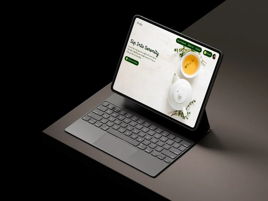
UI showcase
Previous UI, updated UI, and wireframes.
This section only renders the visual artifacts that exist for each project, so unavailable categories stay hidden automatically.

The starting point
Tea is often marketed as natural or calming through visual tropes, but most pages remain generic and transactional.
ZenLeaf needed a homepage that felt different from the noise. The design had to make the first scroll feel calm while still making the shopping journey understandable.
This was the central tension: preserve emotional calm while still leading users toward meaningful actions.
The challenge
Most pages in this category either over-style the brand or over-sell the product. ZenLeaf needed to avoid both.
How do you sell wellness without sounding transactional?
How do you show products clearly without breaking visual serenity?
How do you communicate premium quality through tone, structure, and detail rather than obvious copy only?
The approach
I worked across three lenses so every decision supported the same intended mood and behavior.
- Visual design: a warm cream and forest palette with selective amber accents to communicate calm and craft
- Interface design: clear CTA placement, logical section flow, and readable card hierarchy
- Experience design: narrative storytelling that supports trust before pushing purchase actions
Visual direction
Typography, color, and photography were treated as emotional infrastructure, not decoration.
- A display type with handcrafted character for titles and a clean sans-serif for body rhythm
- Muted neutrals and deep forest tones to anchor trust and reduce visual aggression
- Warm gold accents reserved for highlights so calls-to-action and key details always stand out
- Organic dividers and soft geometric transitions to keep the page feeling fluid
Interaction and interface
I prioritized scanability and action clarity in each product and CTA zone.
- A consistent section rhythm from hero to product areas and brand storytelling
- Primary actions such as Explore and Add to Bag placed at moments of intent
- Product cards with stronger hierarchy: image, title, description, price, action
- A calm micro-pattern of spacing and alignment so the interface never feels crowded
Process
The process started with understanding what made ZenLeaf's identity authentic: organic materials, mindful rituals, and premium quality.
I then explored multiple palette and typography options and chose a direction that made the brand feel both earthy and elevated.
From there, the page was structured as a narrative journey: hero, collection, story, offers, and call-to-action in a natural progression.
High-fidelity mockups were developed in Figma and iterated for hierarchy, spacing, and emotional consistency.
Outcome and impact
The final layout gave the brand a clear visual voice and a smoother browsing rhythm.
Shoppers can now move through a calm story first, then naturally enter product discovery and conversion areas.
The design creates stronger first-impression trust while still keeping business goals in view through visible, intentional CTAs.
- Stronger first-screen identity through coherent palette and layout language
- Clearer conversion structure across sections and product presentation
- More cohesive premium feel from hero to footer-level closure
- A scalable foundation for future section expansion and mobile adaptations
Reflection
ZenLeaf reinforced a core principle in my practice: restraint is often the hardest design skill.
The strongest decisions were about what to remove, not what to add.
Restraint improved usability, reduced cognitive load, and made the brand feel more sincere.
If extended, the next steps would include full catalog, cart and checkout flows, and an even deeper mobile-first sequence that preserves the same mood under tighter constraints.
“This project showed how design for e-commerce can still feel poetic and intentional. The objective was not to over-push the purchase. It was to make visitors feel calm, trust the brand, and arrive at action with no friction.”