Arcflow: Two Surfaces
One app, two products. A window you open on purpose, and a runtime nobody ever looks at.
Arc Flow is two products in one: a settings window nobody should have to learn, and a runtime overlay with no canvas, no focus and no right to your attention. I designed both, and most of the month went on what happens when the second one fails.
View Site
Goal
Design a dictation tool that separates the conventional management window from an unconventional runtime, giving each the appropriate level of design investment without forcing users to learn a new interface for the parts that should be familiar.
Challenge
The runtime has no window, no focus, and no attention. Every convention for showing state assumes somebody is looking at a window. Here, nobody is. The normal toolkit is unavailable: no modal, no toast in the corner, no progress bar, and no text preview during speech.
Outcome
A two-surface architecture where the management window gets deliberate convention and the runtime gets deliberate invention. A floating overlay driven by live microphone level, a four-key hotkey scheme, clipboard snapshot-and-restore, and a failure philosophy where no branch ends in the user's words being lost.
Arc Flow is two products sharing one binary. A settings window that should surprise nobody, and a dictation runtime with no window, no focus and no attention. They have almost nothing in common as design problems. Deciding which one gets convention and which one gets invention was the actual product decision.
Project overview
Arc Flow is a privacy-first voice dictation tool for Windows, built solo as a personal side project. You press a key inside any application, you speak, and text appears at your cursor. This study is about the design split at the heart of the product: a conventional management window, and an unconventional runtime overlay that has to communicate state without anyone looking at it.
- Built solo as a personal side project (started 30 June 2026, ongoing development).
- 146 commits across active working days.
- 20+ downloads, around 5 daily active users.
- 6 to 7 people reporting bugs directly.
UI showcase
Previous UI, updated UI, and wireframes.
This section only renders the visual artifacts that exist for each project, so unavailable categories stay hidden automatically.
- UI showcase
- The two surfaces
- The window gets convention on purpose
- The runtime has no canvas, no focus and no attention
- The dynamic island
- Four keys, and why one of them cannot be changed
- Failure, which is most of the design
- Latency, and not decorating the wait
- Where the two surfaces meet
- What is still wrong
The two surfaces
Arc Flow is two products sharing one binary.
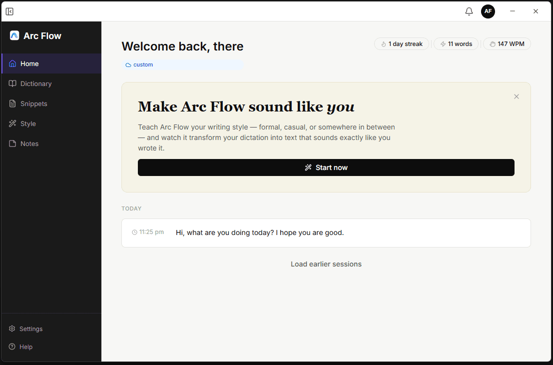
There is a window. It sits quietly in the system tray, and you open it when you want to add a word to your dictionary, write a snippet, change your writing style, or fiddle with a setting. It looks like a normal desktop app because that is exactly what it should look like.
And then there is the part where the product is actually used, which has no window at all. You press a key inside some completely different application, you speak, and text appears at your cursor. Your eyes never leave the thing you were typing into.
These two surfaces have almost nothing in common as design problems. Treating them as one product is, I think, how dictation tools end up feeling slightly off.
The window gets convention on purpose
The management window has Home, Dictionary, Snippets, Style, Notes, Settings and Help. It is a sidebar and a content area. Nothing about it will surprise you.
That is deliberate and I am not going to apologise for it. Somebody adding the word "Kubernetes" to their dictionary so it stops coming out as "cuber netties" does not want to learn a new navigation model. A settings tree is not where a small tool should be inventive. I spent the design effort on the runtime, which is the part with no precedent.
One decision inside the window is worth pulling out, because it cost me something. Most dictation tools install in three steps and your audio quietly starts going to a server. Arc Flow adds a step. During onboarding you choose: run everything on your machine, or connect a cloud provider with your own API key.
The compromise I landed on: the choice is made once, in plain language, and after that the app never nags. But whenever cloud processing is active, a badge on the runtime overlay names the provider. You should not have to remember what you picked three weeks ago.
What that privacy step actually costs
The cost of that step is real. Setup takes longer, the demo is worse, and some people definitely drop off at a screen that asks them to make a decision before they have even heard the product work once. I still think it is correct. If the entire pitch is "your voice does not leave your machine", then burying that in Settings and defaulting it on would make the pitch a lie by convenience.
The runtime has no canvas, no focus and no attention
Now the interesting half.
When dictation is running, the user is inside Gmail or VS Code or WhatsApp, looking at a blinking cursor. Every convention we have for showing state assumes somebody is looking at a window. Here, there is no window being looked at.
So a lot of the normal toolkit is unavailable:
No modal: stealing focus would break the thing we are about to paste into.
No toast in the corner: wrong side of the screen, wrong monitor half the time.
No progress bar: nobody is watching it.
No text preview during speech: this one was a real decision, covered below.
What I had instead was: a small floating overlay, and two sounds.
The tray icon, which never changes
The tray icon, worth saying, never changes. It is one static icon with a tooltip and a two item menu, Open and Quit. It marks presence, not state. Making it flash colours for idle, listening and processing was tempting and would have been useless, because the taskbar corner is the furthest point on the screen from where the user is actually looking. State belongs near the cursor.
The dynamic island
The overlay sits bottom centre, above the taskbar. A waveform in the middle driven by live microphone level. A cross on the left to cancel. A tick on the right to stop and insert. And no text preview.
That last one gets questioned every time somebody sees it, so here is the argument. If I show you the transcript while you are still speaking, I am asking you to read and speak at the same time. You will read it. Everybody reads it. And then you will stop mid sentence to check whether it got "Kubernetes" right, which is exactly the flow the product exists to protect. The waveform tells you the one thing you actually need mid sentence, which is "yes, I can hear you." Everything else can wait four seconds.
Two things I got wrong about the overlay, both found by users, both about location. On multi monitor setups the island simply did not appear. At all. After fixing that, I positioned it on the monitor where the mouse cursor was. Wrong again. The mouse is not where attention is. Attention is at the text field you are dictating into. So the island now follows the monitor of the application receiving the text, not the mouse.
That second fix is a two line change and about a week of not realising it was wrong.
A bug about window focus that took a week to see
There was also a lovely bug where the island would stop appearing after the app sat idle for a while, even though dictation itself kept working perfectly. So people were getting text inserted with no visual confirmation, which is unsettling in a way that is hard to describe. Users were restarting the app to fix it. The app now quietly checks on its own overlay in the background and repairs it if it has gone missing. Self healing UI is not a phrase I expected to use in a dictation app.
Four keys, and why one of them cannot be changed
The hotkey scheme was not designed up front. It was argued into existence over about four days. Four dedicated keys instead of one key with modifiers, because modifiers require the user to remember a rule while they are already composing a sentence in their head. Dictation is a low attention activity. The interface should ask for as little working memory as possible.
Four keys: Ctrl+Space (dictate, rebindable), Ctrl+D (rewrite selected text, rebindable), Ctrl+Q (dictate into note, rebindable), and Ctrl+Win (master on/off toggle, fixed/not rebindable).
The master toggle is fixed at Ctrl+Win and cannot be rebound. The control that disables all the other controls should not itself be reachable through a configuration that might be broken. If you have bound yourself into a corner, there needs to be one chord that always works. It also needs a hold of about one second rather than a tap. Two modifier keys get pressed accidentally all the time.
The bug that defined Command Mode
The bug that defined Command Mode: Ctrl+D rewrites selected text. Early on, if you pressed it with nothing selected, it would quietly fall through and behave like normal dictation instead. That sounds harmless. It is not. In a runtime with no window, a mode that silently becomes a different mode means you find out only when the wrong text is already sitting in your document. I reverted the feature that caused it and made Command Mode fail loudly with nothing selected. A tool that refuses is better than a tool that improvises.
Failure, which is most of the design
The happy path took a week. The unhappy paths took the rest of the month.
No text field focused: you press the hotkey while looking at your desktop, or a read only window. Early version: the text just vanished. Now the app checks whether an active text caret exists, and if not, the overlay expands into a small popup showing the full transcript with a Copy button. The words are never thrown away. This turned out to matter more than I expected, because people dictate first and figure out where it goes second.
The app refuses the paste: some Windows apps just will not accept it. Same principle: the transcript stays on screen so you can copy it, rather than disappearing with an error.
The clipboard, and how app compatibility got handled
The clipboard: insertion works by pasting, which means writing to your clipboard. Quietly destroying whatever you had copied is a real, small, infuriating data loss. So Arc Flow snapshots your clipboard, pastes, and puts your content back. And it only restores if the clipboard still holds exactly what Arc Flow wrote, so if you happened to copy something during that half second window, your copy wins. Nobody will ever notice this working, which is sort of the ideal.
App compatibility: I started with a list of known applications, which is how everybody starts and is wrong. A list is a treadmill and it fails for every app not on it. It now detects the active text surface itself, so it works in apps I have never heard of, and read only fields stay protected from accidental insertion.
Latency, and not decorating the wait
Local models are slower than cloud. That is the deal you accept for privacy.
My first instinct was the usual one: make the waiting nicer. Better spinner, nice easing, some reassuring copy.
What actually worked was moving the output earlier. Partial transcripts now stream to the overlay while you are still speaking, so words start appearing before you have finished the sentence. The total time did not change much. The perceived time changed a lot, because the product stopped feeling like it was thinking and started feeling like it was listening.
The lesson I would keep: when something is slow, first check whether you can show a real result sooner, before you spend a day designing a nicer way to wait.
Where the two surfaces meet
Here is the seam I find most interesting and have not fully solved.
You add "Kubernetes" to your dictionary in the window. Later, in a completely different application, with no window open, that word comes out correctly. The two surfaces are connected, but the user never witnesses the connection happening.
Right now this works and is essentially invisible. Which is nice when it works, and confusing when it does not, because there is no moment where the app says "I have learned this." I do not have a good answer yet. A confirmation toast in the window is weak, since the payoff happens hours later somewhere else entirely. This is on my list.
What is still wrong
Written first, before the rest of this page, as an honesty check.
Indian languages need more work. Hinglish and Hindi work, and they work better than they did, but "works" and "works well" are different words. There is a whole class of code switching, mid sentence, that I have not handled properly. This is the part I care about most and it is the part that is least finished. Full section on it in the other case study, because the failure mode there is genuinely strange.
The UI needs a lot of work. I built function first and left the interface for later. This was the right call for shipping and it left a visible debt. The design system arrived on day five, retrofitted onto screens that had already grown their own habits, and I spent most of the following day fixing clipping, overlap and minimum window sizes. It is coherent now. It is not yet good.
One month old, so all of this is fair. But I would rather write it down than have somebody find it.
The rest of the list
There is no cloud infrastructure yet, and it is needed. Not for privacy reasons, for hardware reasons. Low end machines struggle with local models, and right now my honest answer to those users is "use a cloud provider with your own API key", which pushes work onto them. Optional hosted models would fix that. That is a real infrastructure project and it does not exist yet.
Windows only. Mac, Linux, Android and iOS are all wanted, all reasonable, none built.
And the invisible connection problem above. No answer yet.
“Built with Rust and Tauri. Speech via Whisper and Parakeet on device, or a cloud provider if you choose one. Free, no account, no subscription.”